
Asset Visualizer
Xshield — enterprise micro-segmentation platform
problem //
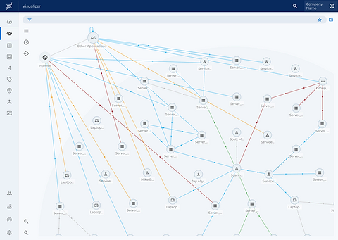
In 2017, I designed the first version of Xshield's Visualizer — a tool that let security teams see their network assets, investigate unwanted traffic, and apply micro-segmentation policies. It worked well as a standalone tool, but ColorTokens was also building three parallel products — Xprotect, Xaccess, and Xcloud — each solving a different piece of network security.
Over time, the company made the call to unify all four into a single platform. That meant the Visualizer could no longer just be a clean, single-purpose tool — it had to become the contextual hub where users could see everything: asset relationships, exposure, traffic direction, and policy enforcement — without forcing them to jump between four disconnected products to investigate one asset.
constraints //
The core risk was complexity creep — more functionality living in one place could easily mean more clicks, more cognitive load, and a worse experience than when the tools were separate. Engineering and leadership wanted the merge to feel like an upgrade, not a burden.
Solutions
5 solutionsContextual side panels instead of page navigation
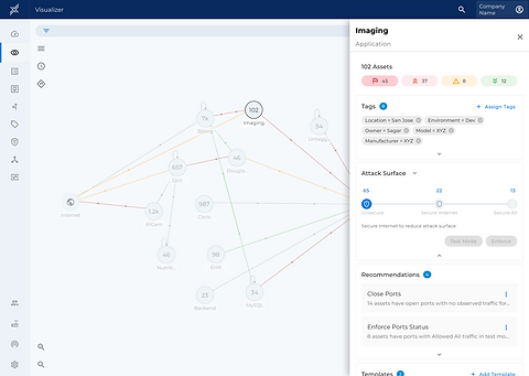
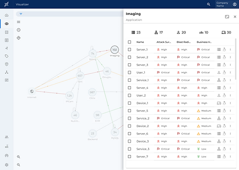
Selecting an asset like “Imaging” opens a detail panel directly in place, showing asset count, tags, attack surface score, and recommendations — so users never lose their position in the network graph.
In-graph toggles for Attack Surface and Blast Radius
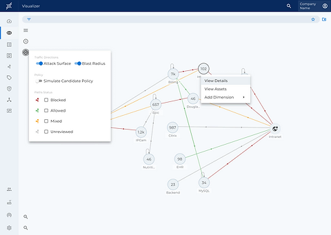
Rather than burying these behind settings or a separate report, I put them as direct toggles on the canvas so users could reframe their entire view of network risk in one click.
Tabbed depth within a single panel
Tags, Attack Surface, Recommendations, and Templates all live within the same contextual panel, so the next action — like enforcing a policy or reviewing a recommendation — is always exactly where the user is already looking.
Progressive disclosure at scale
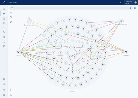
Users can zoom out to a fully expanded view showing hundreds of assets and relationships, or zoom into a single node for a focused investigation — supporting both a security analyst scanning for anomalies and one drilling into a specific threat.
Color-coded traffic paths
Allowed, blocked, mixed, and unreviewed paths become an immediately readable visual language, turning abstract policy states into something the eye can scan in seconds.
outcome //
The redesign let users investigate an asset, its exposure, and its recommended actions in one continuous flow — replacing what used to require jumping between four separate tools. It supported ColorTokens' shift from four standalone products to one converged platform, and became a strong reference point for how the merged product could feel simpler, not more complex, despite doing more.
abstract //
Joined ColorTokens as founding designer before the company had a shipping product. Over seven years I took four enterprise SaaS platforms from 0 to 1 — Xshield, Xprotect, Xaccess, and Xcloud — conceived the Data Visualizer that made invisible east-west traffic legible, built the design system that scaled across the suite, and owned the company's full brand identity.
Use case #03
Device Matrix